Building the cross-platform investment solution from the ground up at Go Invest
The problem
Go Invest wanted a professional investment tool that worked for both new investors and active traders, on every platform they use. There was no product and no designer when I joined. The hard part was serving very different users without making the product too complex for beginners or too limited for professionals.
My role
I was the founding designer in the team. I ran user interviews with traders and investment professionals, defined the core concept and visual language, and designed the web terminal end to end. Later I led design for the mobile and desktop apps, built the design library, and hired and mentored the design team.
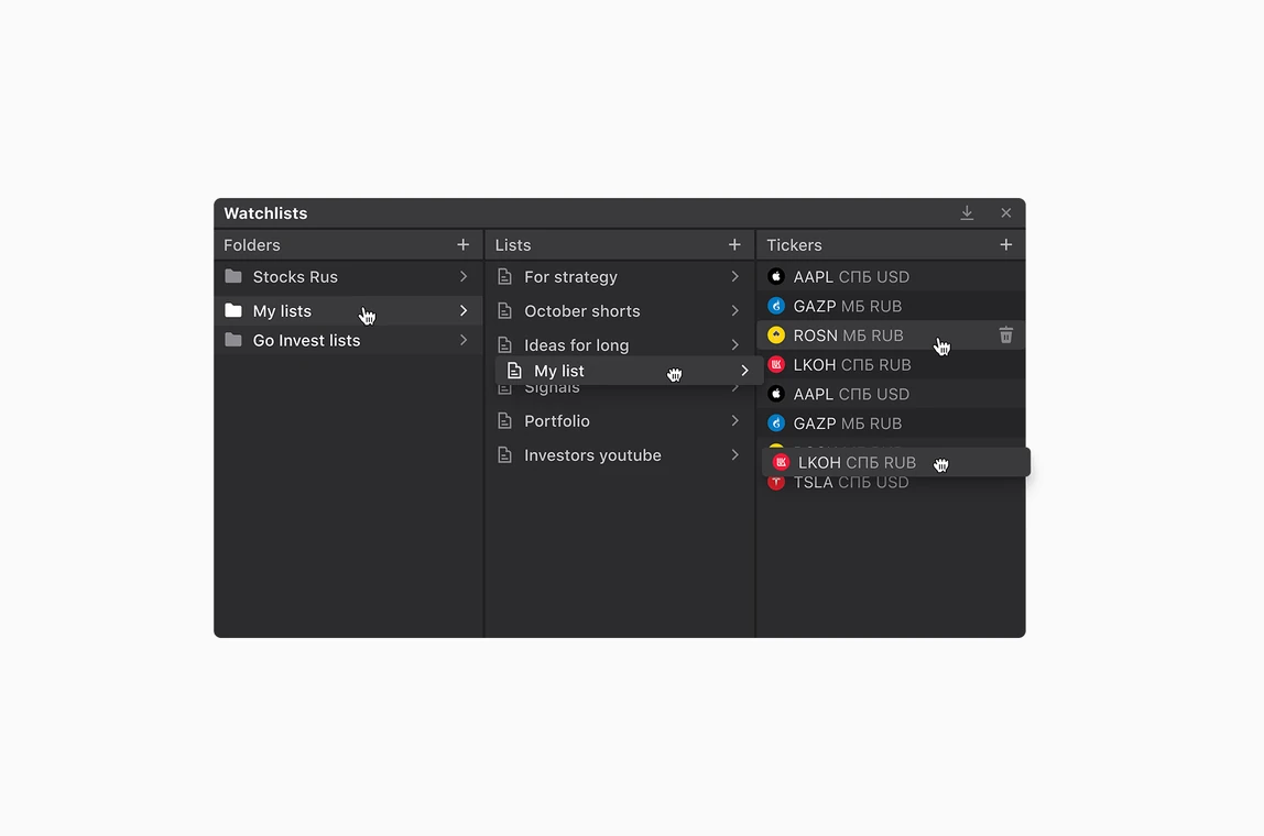
1. A flexible workspace instead of a fixed layout
After a broad review of existing trading terminals, I prepared three layout concepts: fixed, hybrid and fully flexible. I presented them to stakeholders in a series of meetings, explaining the strengths and weak sides of each one.
Then I started user research with a wide range of terminal users, from beginners to seasoned traders. A fixed layout was easier for beginners to understand. Traders, used to flexible workspaces from tools like Bloomberg, all enjoyed setting up the workspace for their own needs. Even the hybrid concept didn't close the gap between the two groups.
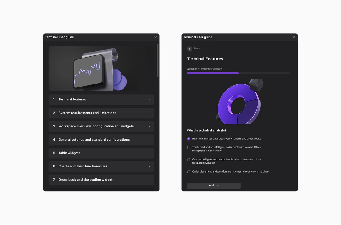
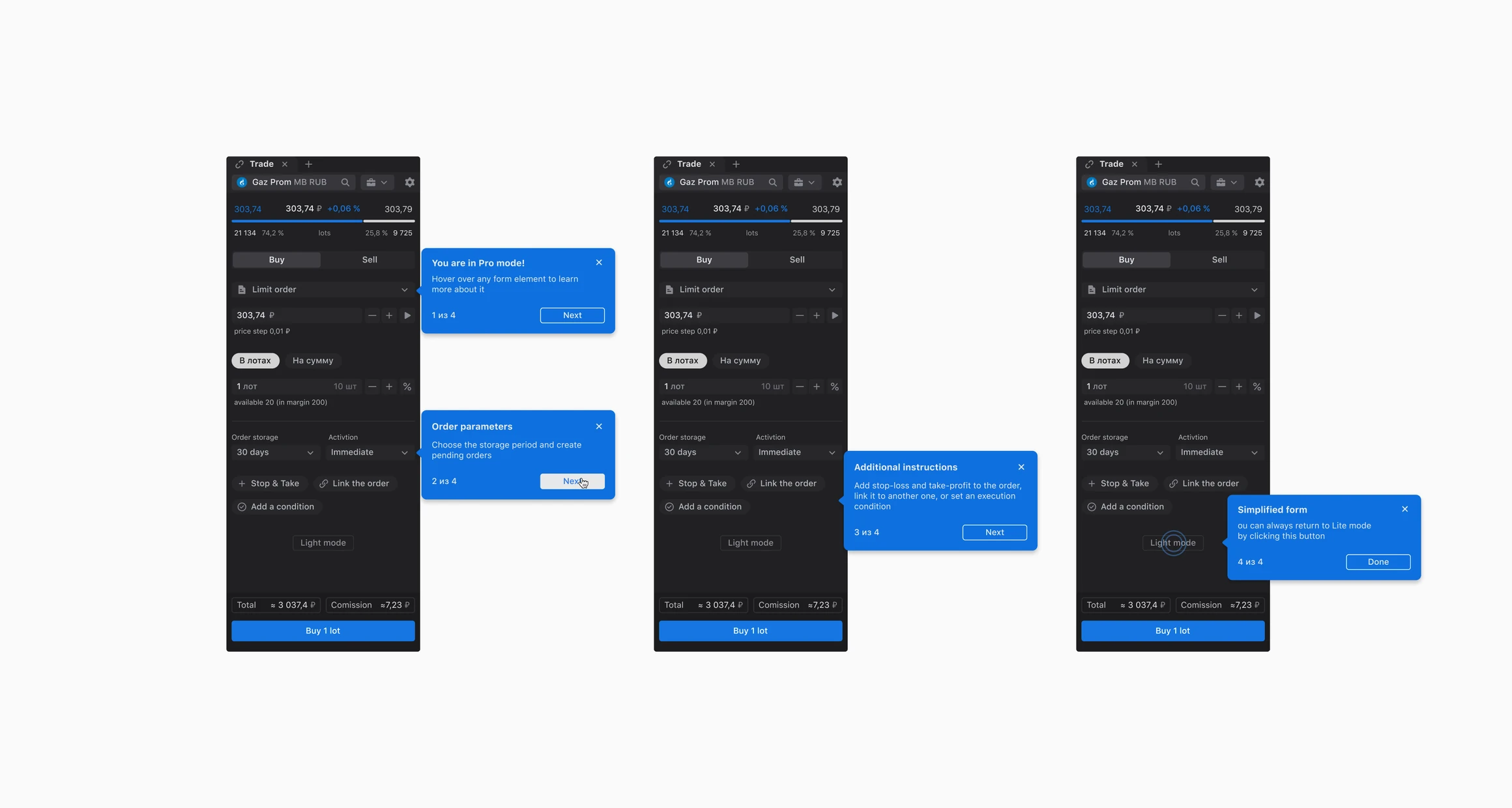
After more discussions with stakeholders, we chose the fully flexible direction. To keep it approachable for beginners, I focused on an intuitive, useful interface and built onboarding and contextual tips that help in the moment.
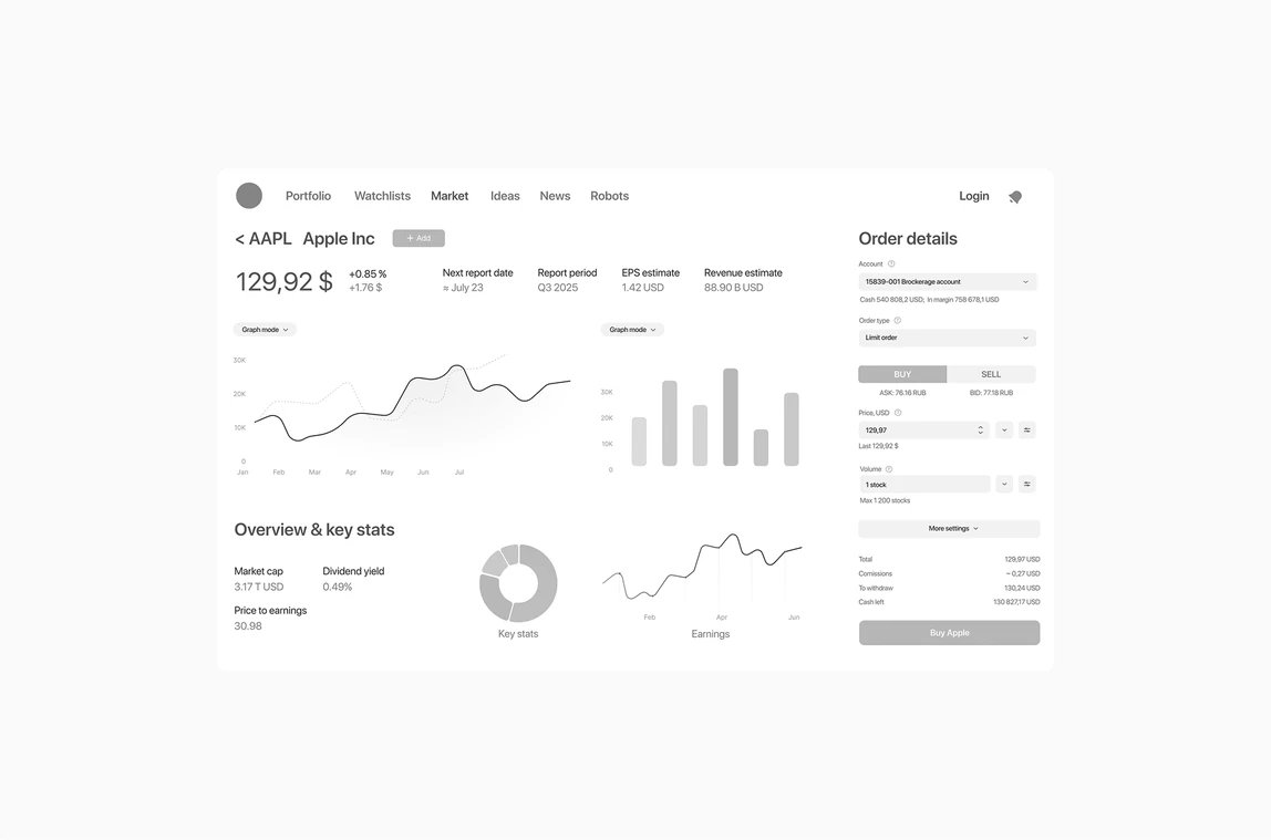
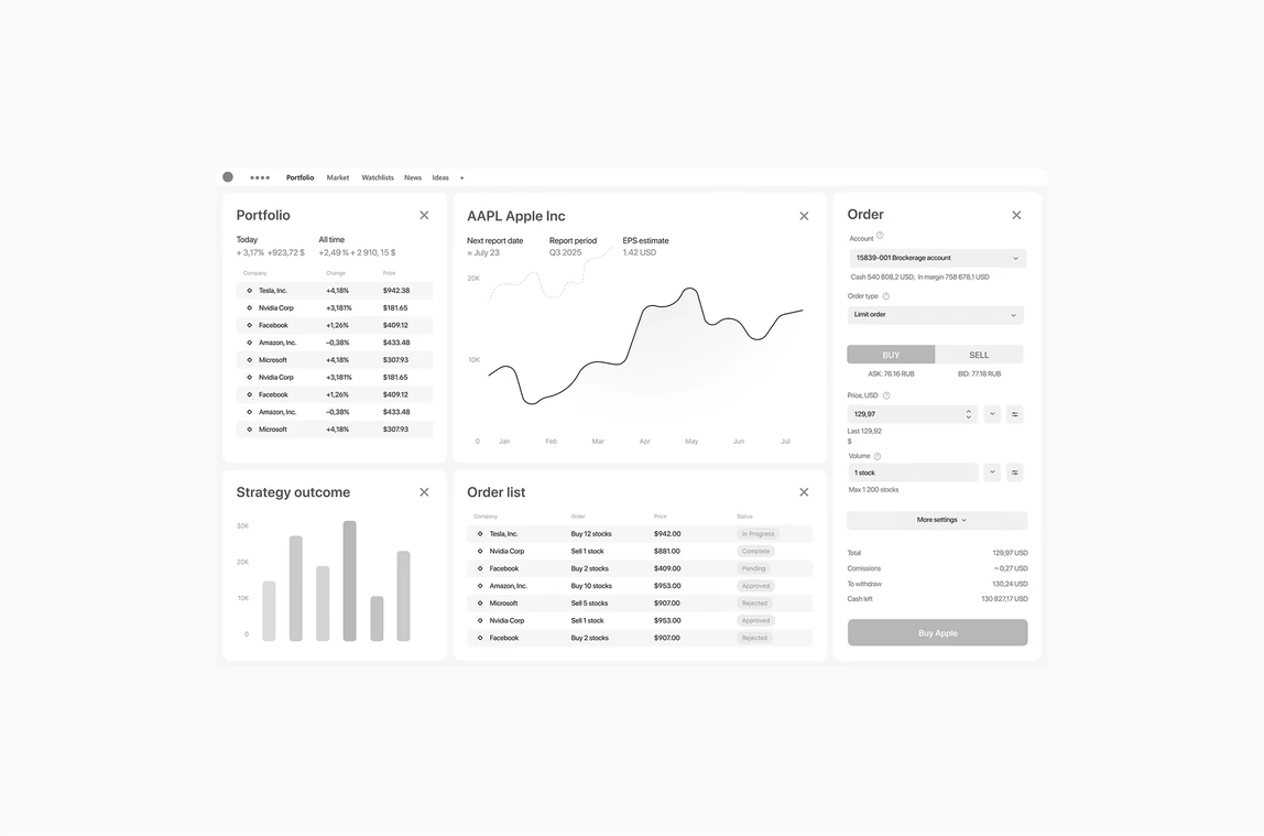
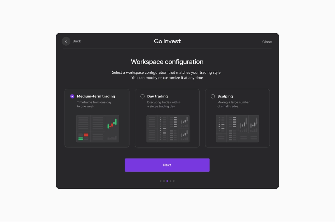
Design library
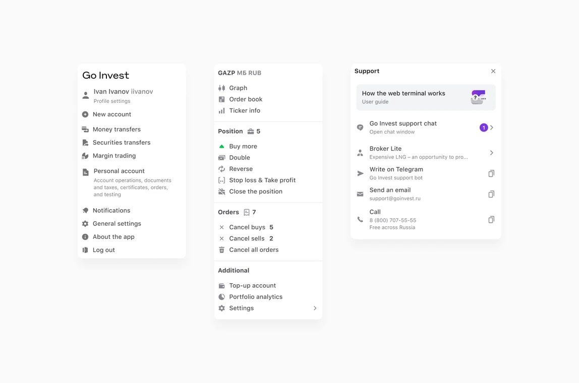
Early on, I laid the foundation of the design library: the key components and guidelines for a dense trading interface. It grew with the product. Mobile adapted the components to native iOS and Android patterns, and the Pro desktop app built on the same base. By the end, the library was adopted across all platforms by 11 teams.
2. Dense data on mobile
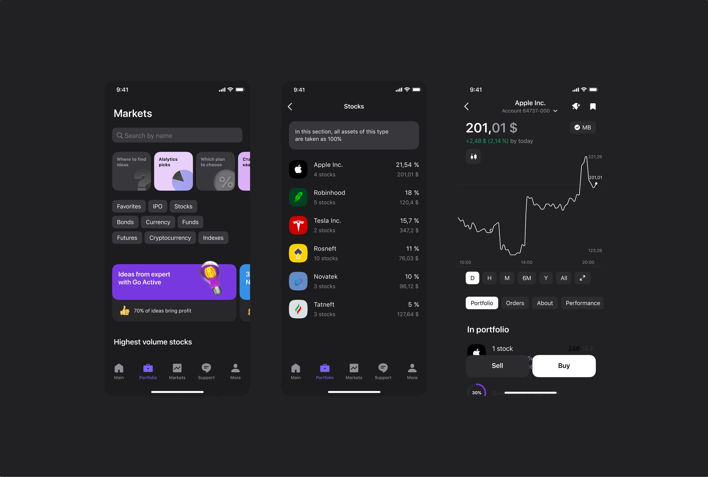
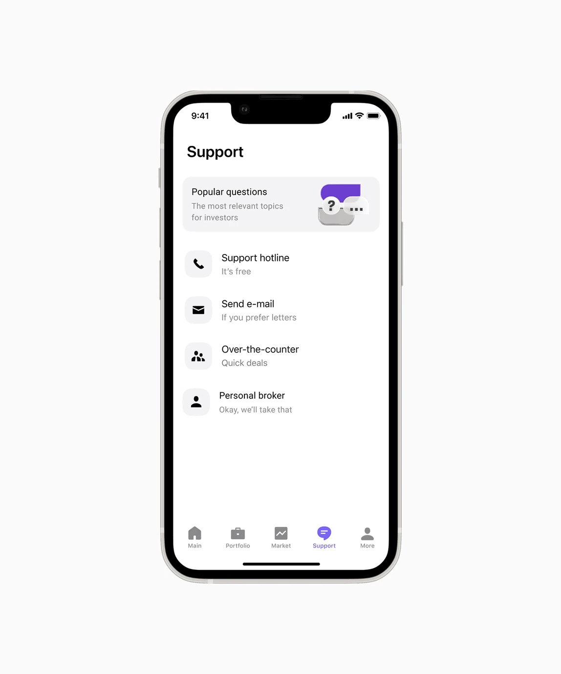
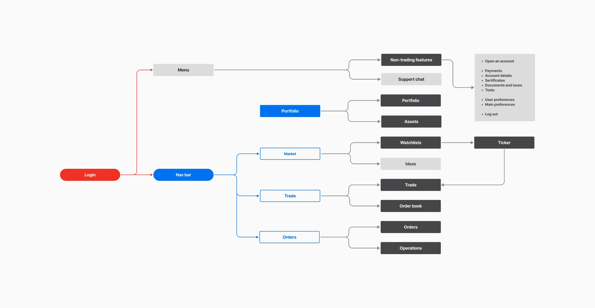
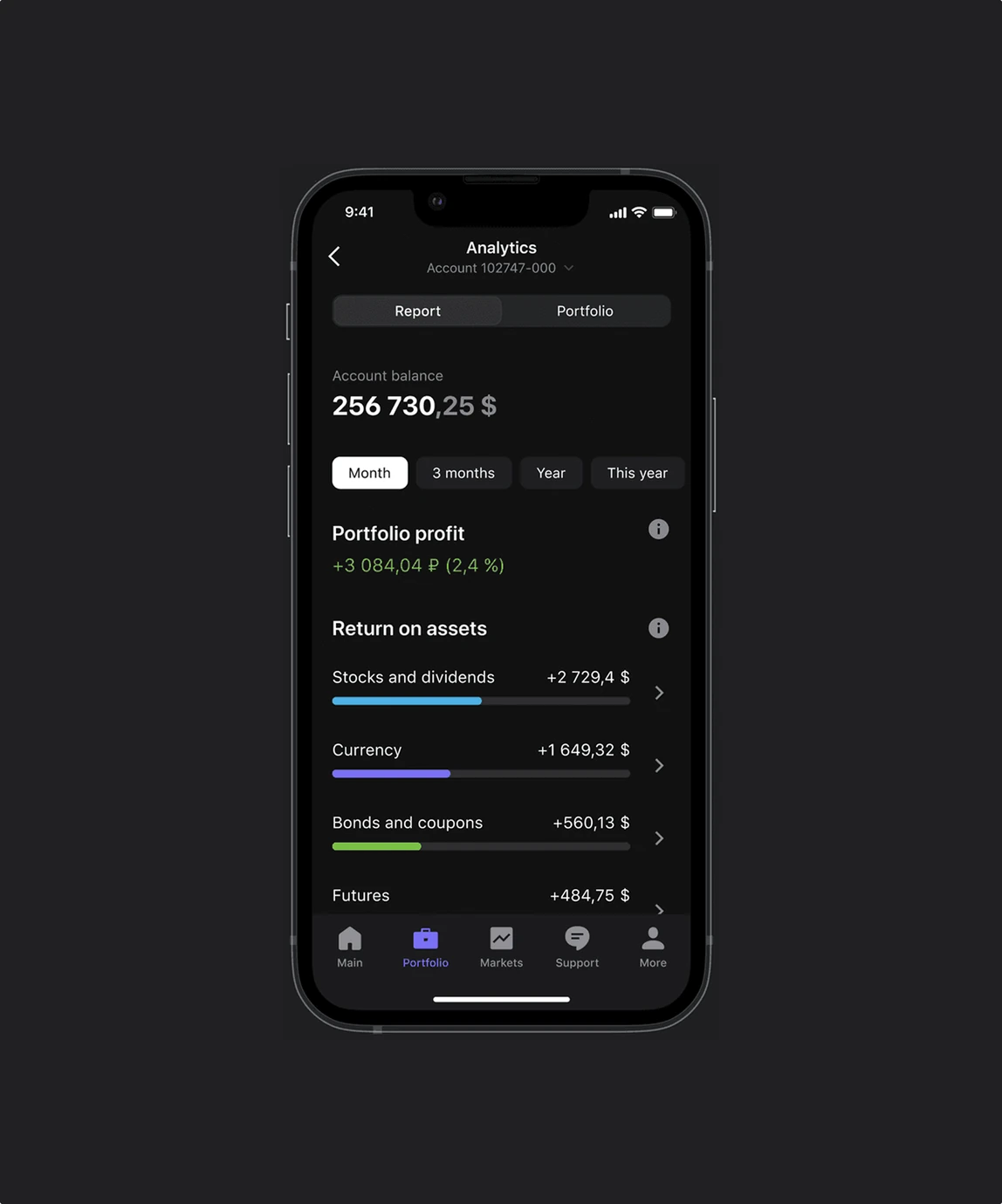
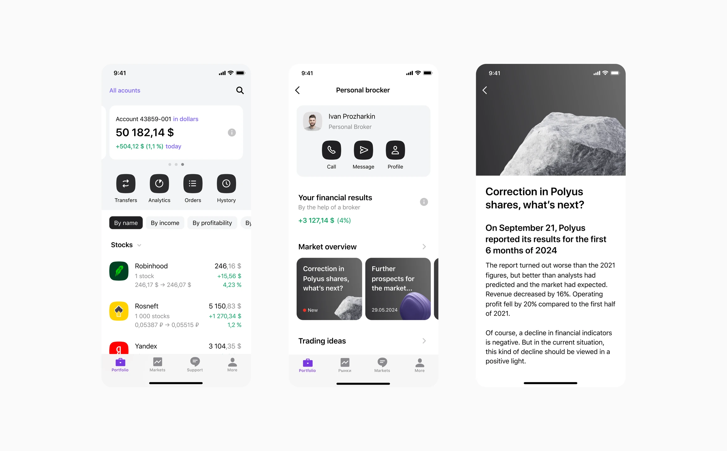
Complex flows and large amounts of data couldn't simply shrink to a phone screen. I chose to rebuild the core flows (trading, portfolio, market stocks) to make them simpler, while keeping all the complex data on screen. I mapped the architecture first, adapted library components to native iOS and Android patterns, and agreed platform behavior with the mobile developers.
The scope was too big for one designer to deliver by the deadline, so I scaled the team. Together with the project manager, I brought in designers from other mobile teams, onboarded them with grooming sessions and customer journey maps, and reviewed every screen for consistency.
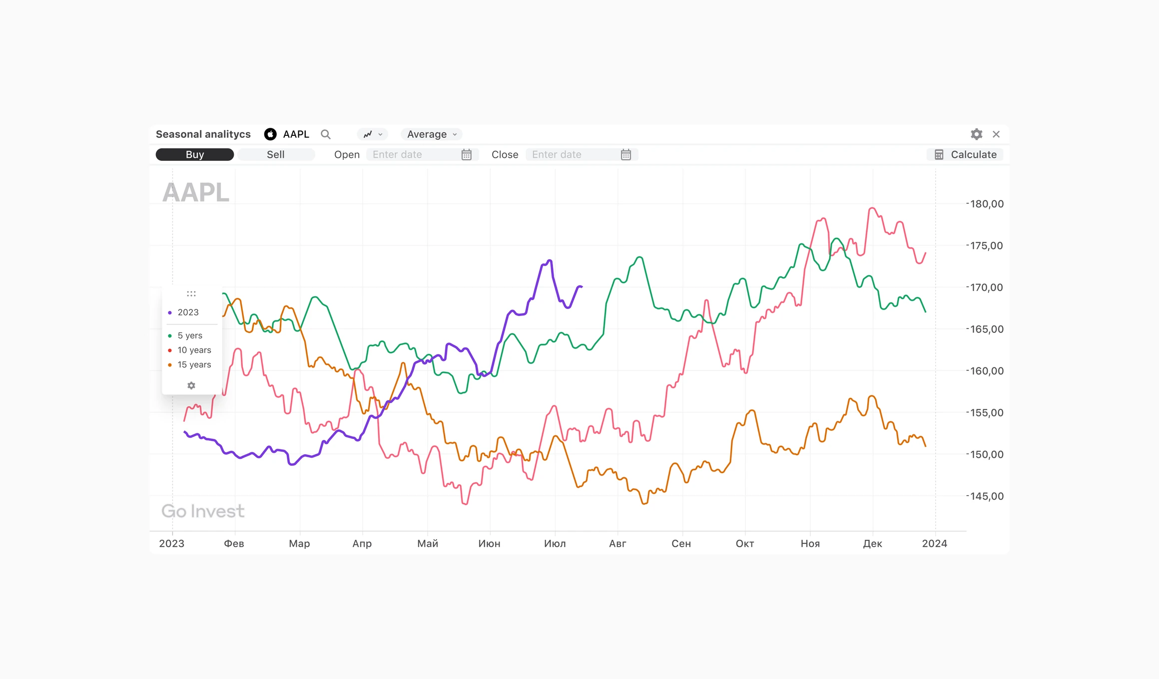
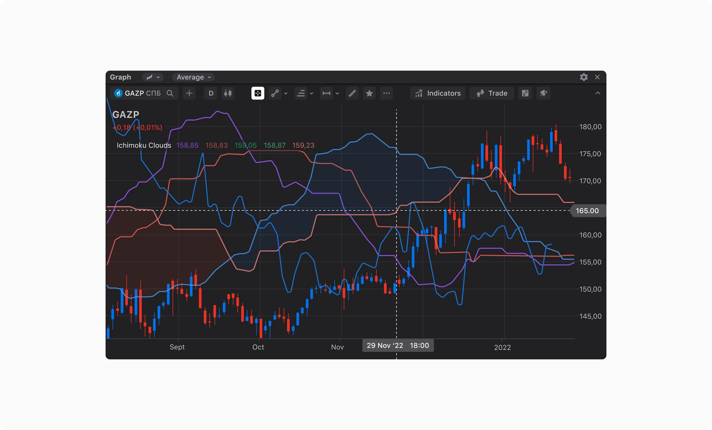
3. Custom charts, compact UI and built-in teaching for Pro
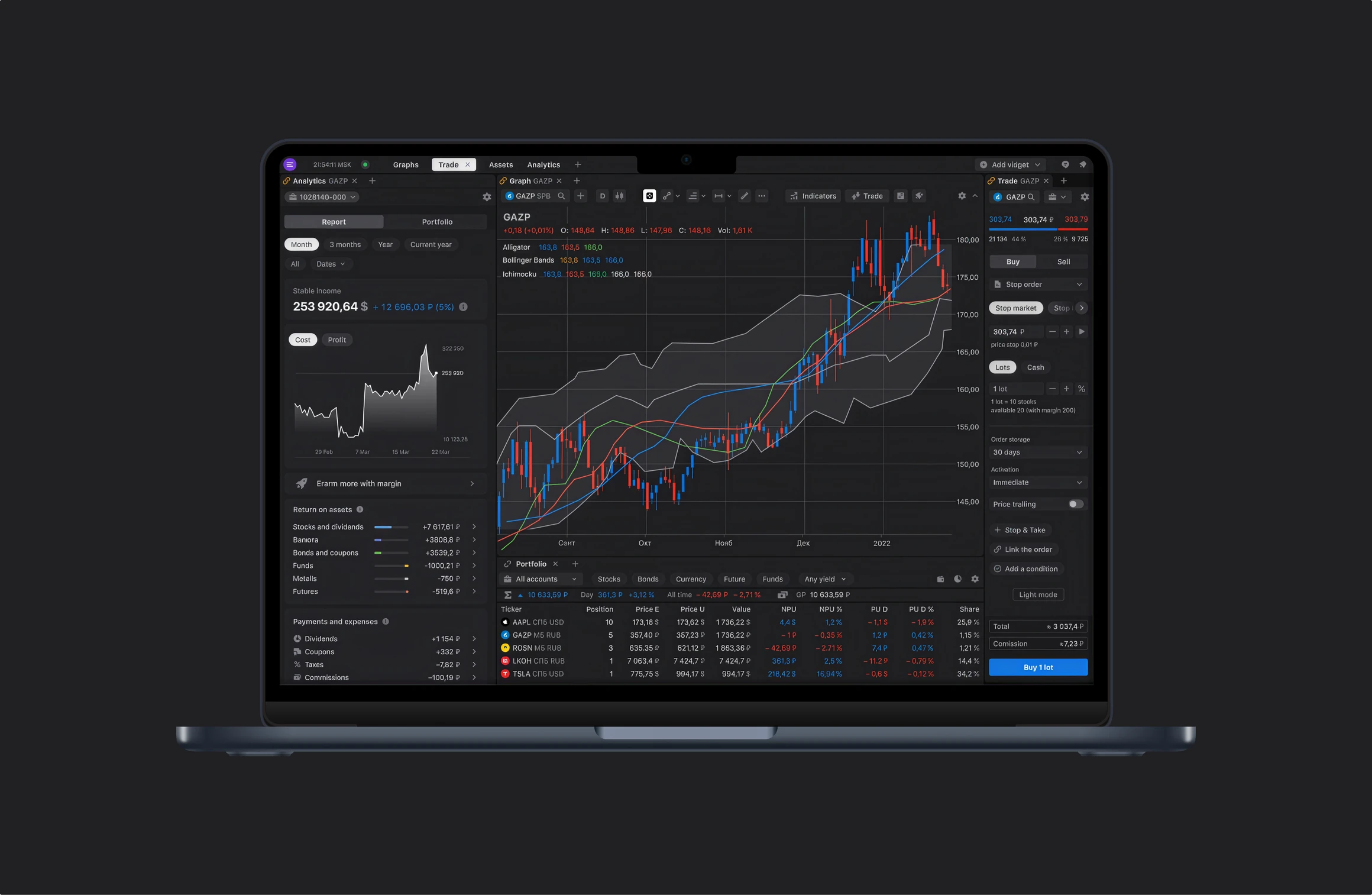
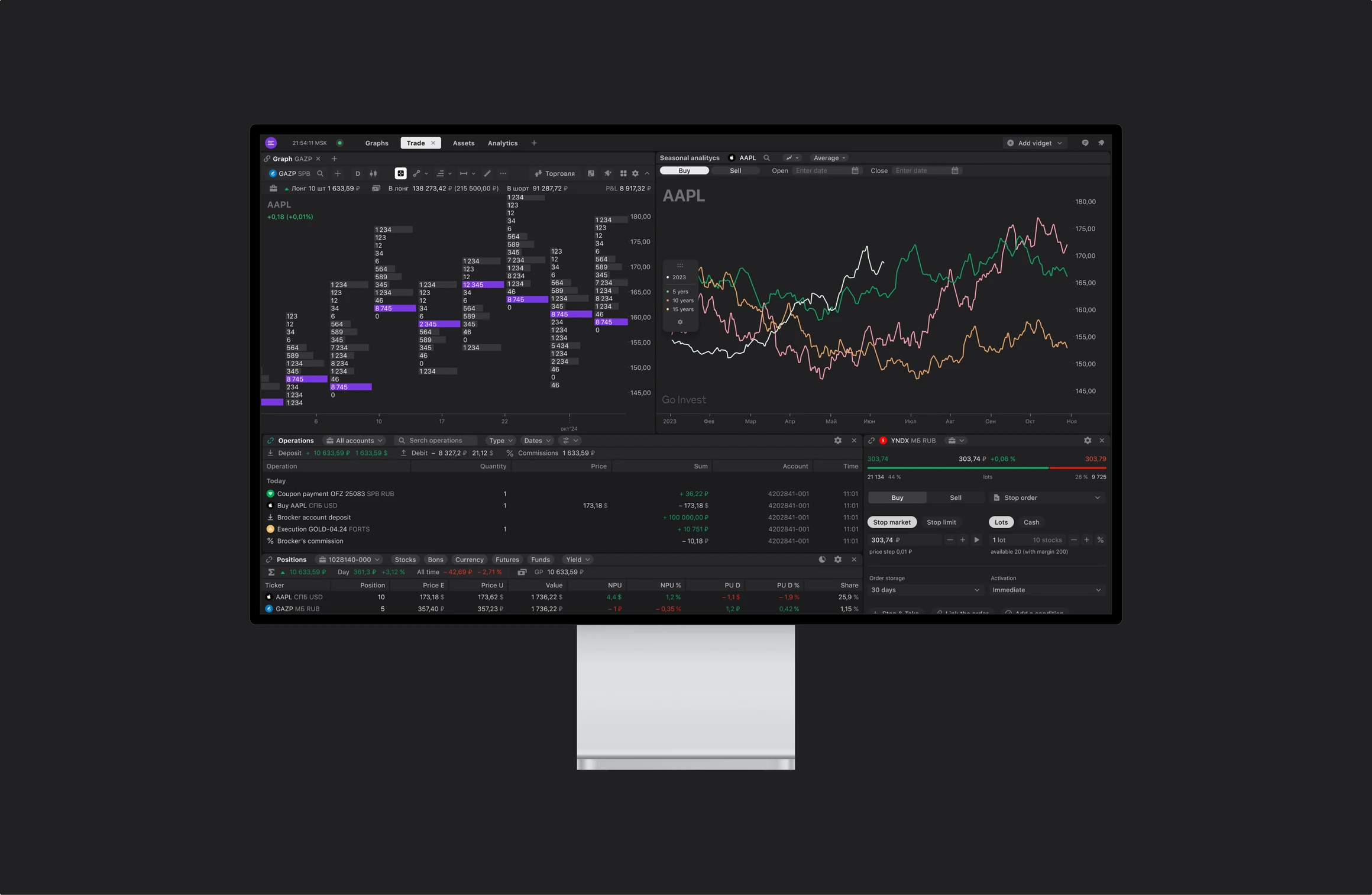
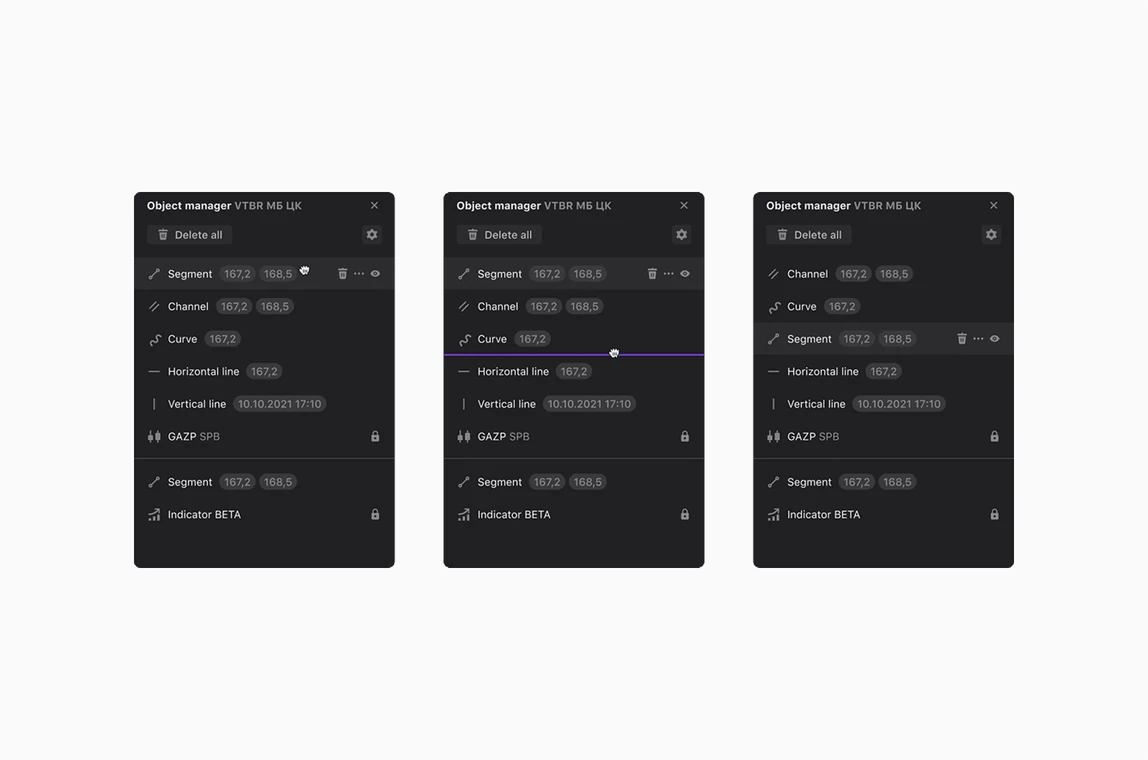
The Pro desktop app had to give professionals many advanced tools without becoming slow or confusing. Extra research with professional traders led to three choices:
• Our own charts instead of TradingView tools. We designed and built our own graphs, which reduced the memory load.
• Smaller UI elements. I reduced element sizes so more tools fit on screen.
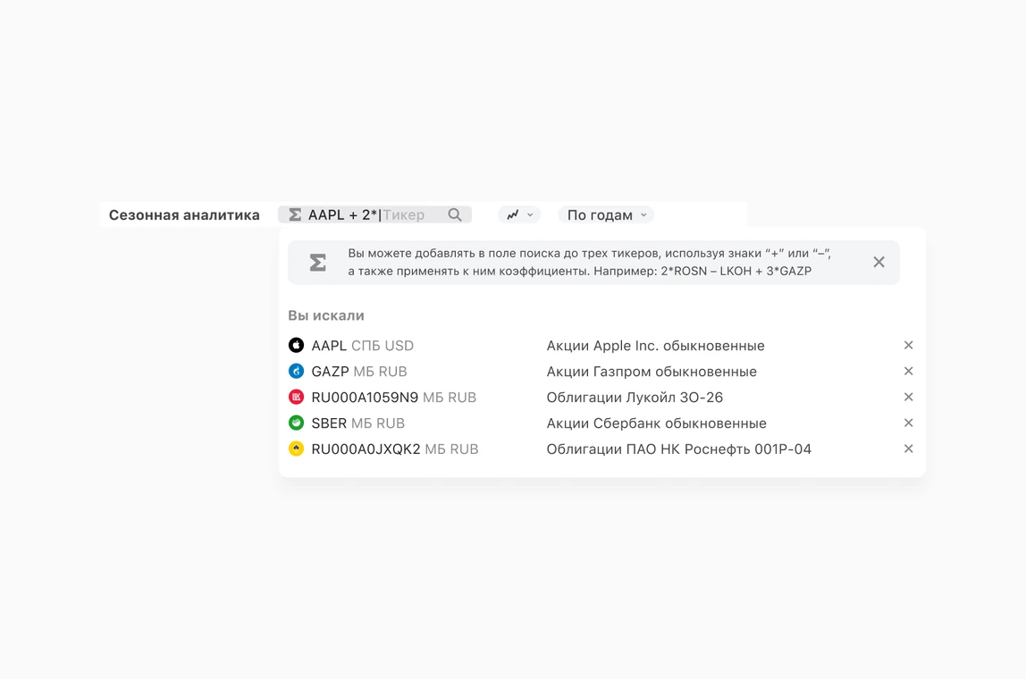
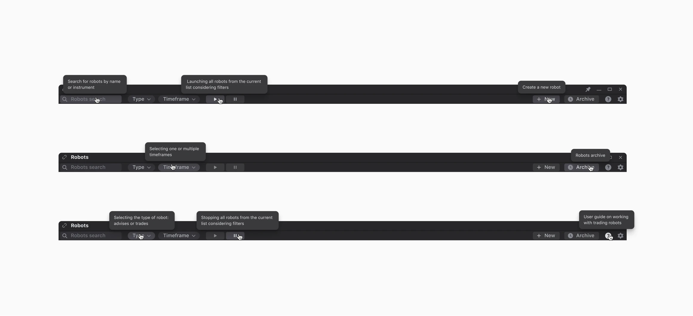
• Teaching inside the product. The Pro app has many complex features, so I added contextual tips and onboarding for each new one.
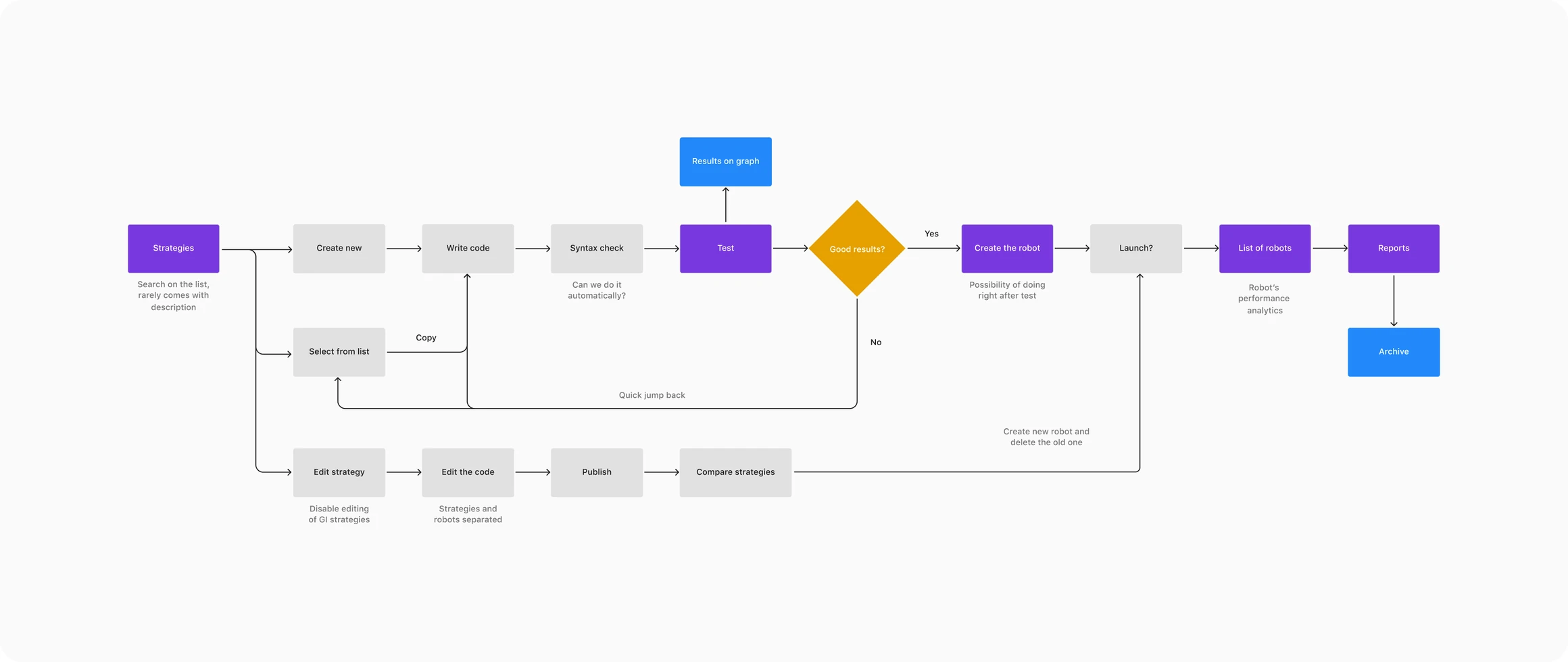
The result is a standalone Pro app for Windows and macOS, with advanced indicators, a trading robot builder and volume profile analysis.
Outcome
• 0 → 500K monthly active users of the core product.
• 16.7% Day-30 retention.
• 4 products on one design library, adopted across all platforms by 11 teams.
• Design team grew from 1 to 5 designers.
• The product became part of the company's core strategy.
With great gratitude to all the teams, designers, and researchers who made this journey so impactful, with special recognition to:
Yulia Tyulikhova, Elizaveta Shalaeva, Andrey Ivanovsky, Fedor Shihirin, Nikolay Borisov, Taras Grin, Sofya Kopilyova, Maria Galukha, Roman Galiev, Andrey Bikanin & more